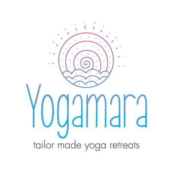
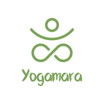
YOGA·MARA - First Draft
For most of my career the turn around time on branding has been quite short, usually to the tune of days rather than weeks or months. Working on the YOGA·MARA brand remains one of my most enjoyable projects as my client trusted me and gave me the time I needed to create something bespoke and special for them.
The brief was to represent wellness, yoga and perhaps most importatantly that their unique selling point was that all of their activites were based by the sea. My first draft of options used the font choice and some graphic elements to hint at flowing water.
This first option chose a light and breezy colours, combining sun, sea and air into one element. Overall this was a very soft and gentle style that, with some refinement could be a nice brand.
Option two attempted to keep things simple by going down a logotype route, letting the colours do most of the talking. In hindsight it was a little too simple but sometimes thats all you need!
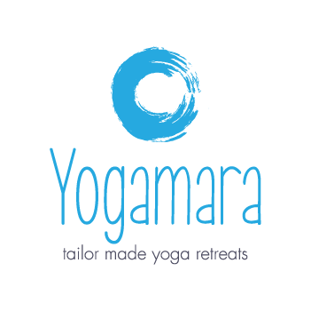
When working on option three it was almost a merger of the first two ideas, I kept the simplicity of the circle but applied a flowing motion to suggest water, I changed the colour to be something more traditionally associated with water.
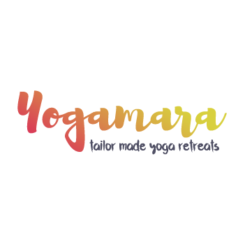
The final option four went a different route altogether and focussed more on the yoga part of the title. Keeping things soft and Irish, I chose a green and went with rounded elements for the person and the flowing letters below.
YOGA·MARA - Second Draft
The first round of branding was appreciated and the client seemed happy enough but I could tell they were not in love with the concepts I had presented. With that in mind I went back to the drawing board and began again but this time focussing on the letter forms of ‘Y’ and ‘M’ as their combined shapes made a nice monogram.
Option one was my first attempt at creating a minimilist monogram, while it was a visually interesting mark it was perhaps a bit too sterile for use in wellness.
The second option made an attempt to ‘jazz it up’ with in hindsight were unnecessary adornments, the result looked similar to a star sign of sorts and while this may have been useful in another scenario, this was not the feeling needed right now.
The last option I felt was the way forward, I took the cleanliness of the first option and combined it with some of the curves of the second and found a nice clean mark that was visually interesting. The Y and the M are present but in the negative space instead of the positive.

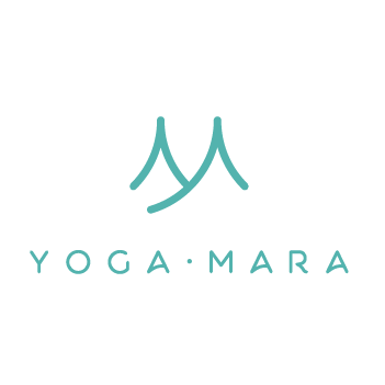
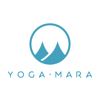
YOGA·MARA - Final
After refining the design to the third option above I was now confident I had something to be proud of and the client would love but it was missing a little something that I couldn’t quite put my finger on.
The negative space revealing Y and M were obvious to me but I found as soon as I popped the design into a circle it brought everything into focus. Changing the softness of ‘M’ to something sharper now looked more akin to a wave and there it was, the final design.
To this day this is perhaps my favorite brand that I have created.